
Mind the Design! Part 6

COLOR STUDY:ORANGE
Part 6 in the Mind the Design! Series
In this part of our Blog Series, we’re discussing the physical and psychological impacts of specific hues (which are defined as the brightest 6 - 12 pure, unmixed pigment families on the Color Wheel). These impacts are intertwined, for obvious reasons. (The better you feel physically, the better your mood, and vice-versa). We now focus on the color orange.

Hovering between yellow and red, orange is a warm hue that is best used as accents and in tints and shades adapted to one’s specific emotional inclination. Like its immediate neighbors, orange stimulates and evokes certain feelings, such as happiness, energy and even hunger. That’s why it’s frequently a color associated with restaurants: orange means appetite and food.
Cultural recognition of orange plays a large part in how it is perceived; as such, it is experienced very differently in Asian countries, where orange represents happiness, love, and immortality, and in Western Europe or the United States, where it signifies warnings, hazards and danger. Orange can also convey a sense of warmth, as in Scandinavian countries or remain undefined, as certain African languages have no specific word for the color.
Notably, orange is a color that should be considered carefully with regard to shade and intensity. In their publication, EFFECTS OF COLOR IN INTERIOR DESIGN, Aleksandra A. Ćurčić, Aleksandar Keković, Dušan Ranđelović, Ana Momčilović-Petronijević. (April 2019) state, “Warm colors are defined as energetic and bold, so they can cause both positive and negative effects. By using warm colors, something can be accentuated, but too much of them, and a space can become congested. Warm colors stimulate the nervous system, so under their influence, the hearth rhythm and blood pressure may be increased, as well as the breathing.”
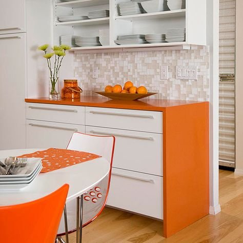
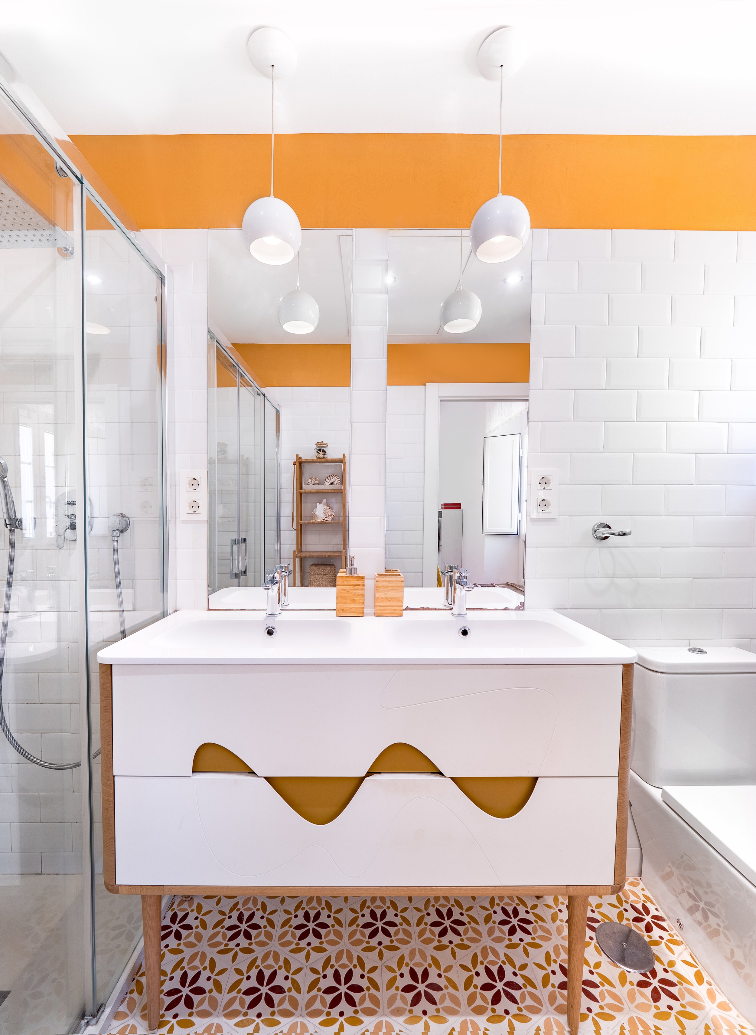
Where and how orange is used in home or work environments, therefore, depends on the individual’s needs. If one experiences depression, orange in a bathroom or bedroom can create a cheerful greeting to start the day off well, whereas if a person wants to be stimulated at mealtime, orange can be deployed in a kitchen or dining area.
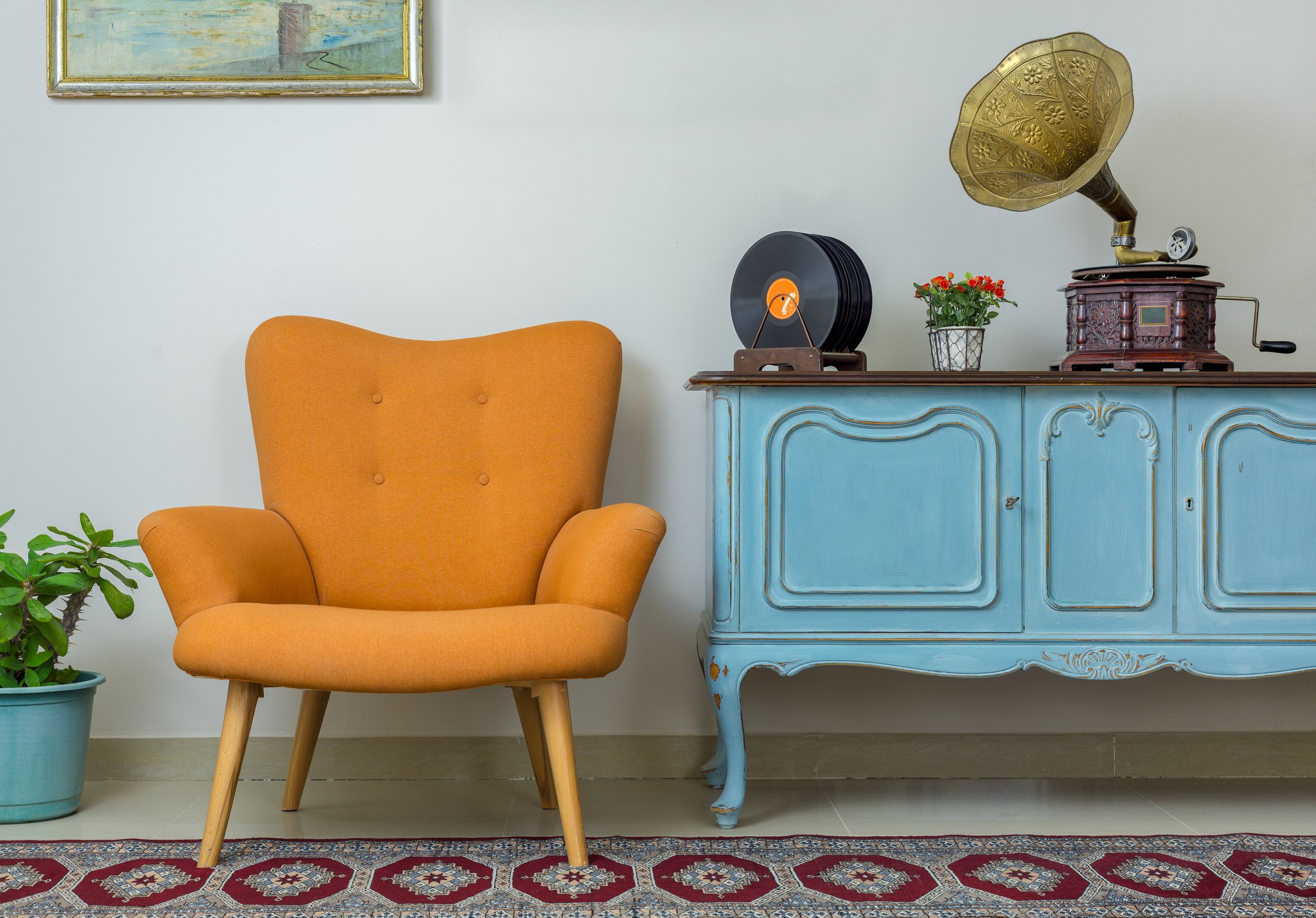
As with other warm colors, orange is best used as an accent and should be paired with neutrals and cool colors.
Since warm colors expand in a space - meaning they are ‘bigger’ than their cool counterparts - the intensity and amount of a warm color such as orange should be proportional to the room. Large expanses can accommodate more stimulating color than small spaces. Because it is a blended hue, orange is frequently clustered with yellow, red, and gold.
Orange is a stimulating hue, and even though its dynamism (the mode of reducing/eliminating tension) is lower than cool hues, it packs a punch with the emotional tone (mood or feeling) it promotes. The complexity of the hue – its tint, tone, and shade – can be moderated toward brighter versions of the color for maximum energy effect and softened when seeking a cozy feeling.

Abstract or Classical Art can bring your accent color to life
Spatial quality – where and how orange is used – can be accomplished in many ways as well:
Add softer tints - by mixing white to the hue - such as tangerine to a wall in a north-facing room
Display artwork that incorporates orange as an uplifting support for cooler colors
Incorporate pops of orange in furnishings, linens, and pillows
Include in spaces where being uplifted or energized is desired, such as bathrooms and bedrooms
Use in rooms intended for stimulation, such as kitchens and dining areas. Even flecks in a countertop can brighten up the space and support other orange accents.
When orange is utilized successfully, the psyche’s evaluation, which is triggered by the perception of the color, will create the energized, uplifted mood you intend.
What can orange do for you? Think about how and where you can incorporate this energetic hue into your space to enhance your well-being.
Check back in December for the next color in our Color Study series.