
Mind the Design! Part 5

COLOR STUDY:YELLOW
Part 5 in the Mind the Design! Series
In this part of our Blog Series, we’re discussing the physical and psychological impacts of specific hues (which are defined as the brightest 6 - 12 pure, unmixed pigment families on the Color Wheel). These impacts are intertwined, for obvious reasons. (The better you feel physically, the better your mood, and vice-versa). We now focus on the color yellow.
Yellow is one of the oldest colors to be used by humans to express emotions. It has been used in art, design, literature, and textiles and dates as far back as cave art where the mineral ochre was utilized to create colorful depictions. Although it has not always been a favored color and its popularity fluctuates with cultural influence - yellow was a signifier of treason in medieval times and used as a way of describing jaundice - the color has always been influential and outspoken in its impact. It is, after all, the color of warnings and caution; utilized in flashing yellow lights, emergency vehicles and signage.
So how do we get to the “sunnier” aspect of yellow? From a physical standpoint, research shows that yellow is one of the colors to have an impact on increased test scores in both men and women, suggesting that it promotes energy and productivity/progression. In fact, when conditions involved the color yellow “Greater spontaneous outward thinking” occurred (Naksian, 1964).

It should be noted, however, that the choice of favored colors may be heavily influenced by one’s current state of mind. Yellow is a preferred color among “healthy volunteers” in experiments, as opposed to grey being chosen by those dealing with anxiety and depression. In research literature yellow “has been reported as being associated with happiness, cheerfulness, and a positive emotional state [5, 6, 27, 28]. It has been suggested that differences in color saturation and brightness are associated with different emotional feelings [29] and it is possible that this could provide an alternative explanation for the different mood color responses that have been observed in this study. For instance, healthy individuals may relate their mood to saturated colors whereas depressed subjects choose desaturated colors.”


FAs such, yellow is often paired with other colors and operates as an “uplifting” contrast. For example, yellow and blue are seen together frequently, such as in Van Gogh’s 1889 work The Starry Night. It is a color of loud optimism and escapism, which was its reported secret meaning in the Beatles’ “Yellow Submarine”.
As evidenced above, mood color response can help explain why people gravitate toward a vibrant color like yellow, or to a more neutral color like grey. Being self-aware can be a tool to help you understand why you may favor one tone over the other. If you are feeling low but have the desire to feel uplifted or inspired, it may be a good idea to consider incorporating yellow in your environment. This does not have to mean that you paint your entire interior space with yellow, but subtle pops of yellow in your décor may ease your dimming mood and inspire a sense of cheerfulness.
We know yellow is a stimulating hue, so dynamism (the mode of reducing/eliminating tension) is already inherent, as is the emotional tone (mood or feeling) it fosters. The complexity of the hue – its tint, tone, and shade – can be moderated toward brighter versions of the color for maximum effect.
Spatial quality – where and how yellow is used – can be accomplished in many ways as well:
Apply to walls in rooms where natural light is limited
Display artwork that incorporates yellow as an uplifting support to other colors
Incorporate pops of color in furnishings, linens, and pillows
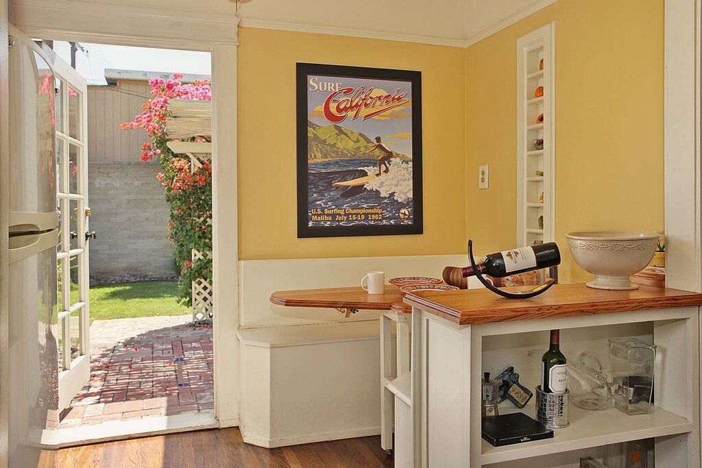
Include in spaces where being uplifted or energized is desired, such as kitchens (especially for those who struggle to wake up in the mornings)
Use in rooms intended for productivity, such as home offices
When yellow is utilized successfully, the psyche’s evaluation, which is triggered by the perception of the color, will create the energized, uplifted mood intended.
What can yellow do for you? Think about how and where you can incorporate this wonderful hue into your space to enhance your well-being
Check back in November for the next color in our Color Study series.
ref 1: 5. Wexner LB: The degree to which colors (hues) are associated with mood-tones. J Appl Psychol. 1954, 38: 432-435. 10.1037/h0062181.
6. Schaie KW: Scaling the association between colors and mood-tones. Am J Psychol. 1961, 74: 266-273. 10.2307/1419412.
27. Schaie KW: A Q-sort study of color-mood association. J Proj Tech. 1961, 25: 341-6.
28. Nolan RF, Dai Y, Stanley PD: An investigation of the relationship between color choice and depression measured by the Beck Depression Inventory. Percep Mot Skills. 1995, 81: 1195-1200.
29. Valdez P, Mehrabian A: Effects of color on emotions. J Exp Psychol Gen. 1994, 123: 394-409. 10.1037/0096-3445.123.4.394.