
Mind the Design! Part 8
COLOR STUDY:BLUE
Part 8 in the Mind the Design! Series
In this part of our Blog Series, we’re discussing the physical and psychological impacts of specific hues (which are defined as the brightest 6 - 12 pure, unmixed pigment families on the Color Wheel). These impacts are intertwined, for obvious reasons. (The better you feel physically, the better your mood, and vice-versa). We now focus on the color blue.
This is a great color to be discussing this month as we are at the start of a new year; it is the perfect time to reset and face the coming months with a renewed mindset that is optimistic and balanced. Blue can help one escape from the high energy and overwhelming nature of the holidays and year-end stress as well.
Blue sits at the other end of the spectrum from the warm hues we’ve recently examined and tops the list of preferred colors. In fact, numerous studies show that blue is predominantly favored by adults for a variety of reasons. According to Interior Color and Psychological Functioning in a University Residence Hall: Marco Costa, Sergio Frumento, Mattia Nese, and Iacopo Predieri, Frontiers in Psychology. 2018; 9: 1580,– citing the pioneering work by Eysenck (1941) who established a universal preference hierarchy in colors - the most preferred color was blue, followed by red, green, violet, orange, and yellow.

Signs of life - blue sky and water are naturally appealing to the human psyche.
According to same study, “The blue interior color was considered to promote and facilitate studying activity more than lighter and warmer colors (such as orange and red) that probably were perceived as too arousing (Küller et al., 2009). Furthermore, [they] found an association between a blue color preference and the “calm” rating in the mood scale. These results can be explained considering that the color blue is often associated with openness, peace, and tranquility (Kaya and Epps, 2004), in contrast with red that is often associated with dangers, activation, erotic pleasure (Elliot et al., 2007). Furthermore, Mehta and Zhu (2009), from a series of six studies, demonstrated that blue (versus red), activated an approach motivation and enhanced performance on creative cognitive tasks. These results were further confirmed by Xia et al. (2016).” As such, blue light, as it is perceived by the brain, has been attributed to lowering heart rates, and thus is considered to be a calming, serene color that can relax while also promoting concentration and productivity by reducing more stimulating distractions.
There is a notable correlation between blue and the natural elements that convey life: water and clear sky. The concept of ‘blue space’ utilizes water in design forms from actual water treatments (like ponds, fountains, pools, etc.), to water sounds and visual representations. Humans tend to associate positive experiences with life-affirming attributes, which can explain the preference of cool colors over warmer hues. Blue is a restorative and rejuvenating color which allows for contemplation, mental clarity and a sense of overall wellbeing and connection to oneself which can, in turn, benefit those around you.
Blue is also seen as a symbol of success, stability and maturity, and is frequently used in marketing by banks, insurance companies, and hospitals to engender trust.

The Blues - avoid creating sadness in a room by careful placement and tints and shades.
If blue is such a great color, why, then, is it also so associated with sadness? The answer is the other side of the same coin that makes it so popular. While it can reduce one’s heart rate, and offer a calming influence, it can just as easily depress and isolate - creating ‘the blues’. Consider Picasso’s ‘blue period’, for example, wherein his paintings depicted sadness and aloofness. And, in even more striking opposition to the sense of well-being blue can engender is the impression of death – or literally ‘turning blue’. Be careful how you deploy blue if you tend toward sadness or low moods. The choice of shade and location within a home or work environment can determine which way the color blue will influence the inhabitants.
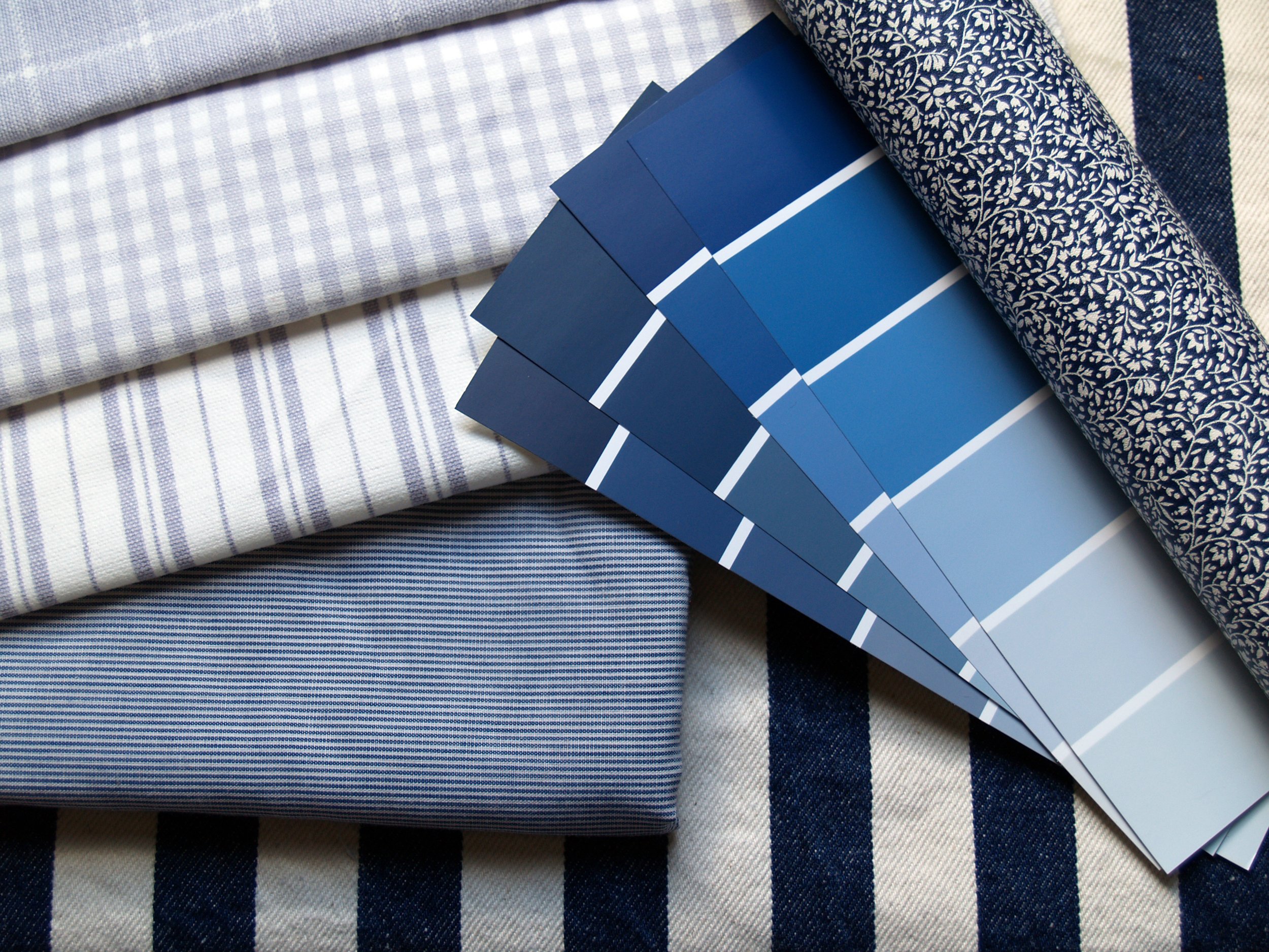
Since blue is a calming hue, its dynamism (the mode of reducing/eliminating tension) is high, and the emotional tone (mood or feeling) it promotes will depend largely on where and how it’s deployed. The complexity of the hue – its tint, tone, and shade – can be moderated toward more vibrant or saturated versions of the color for maximizing productivity and deepened when seeking a more serene effect
Spatial quality – where and how blue is used – can be accomplished in many ways as well:
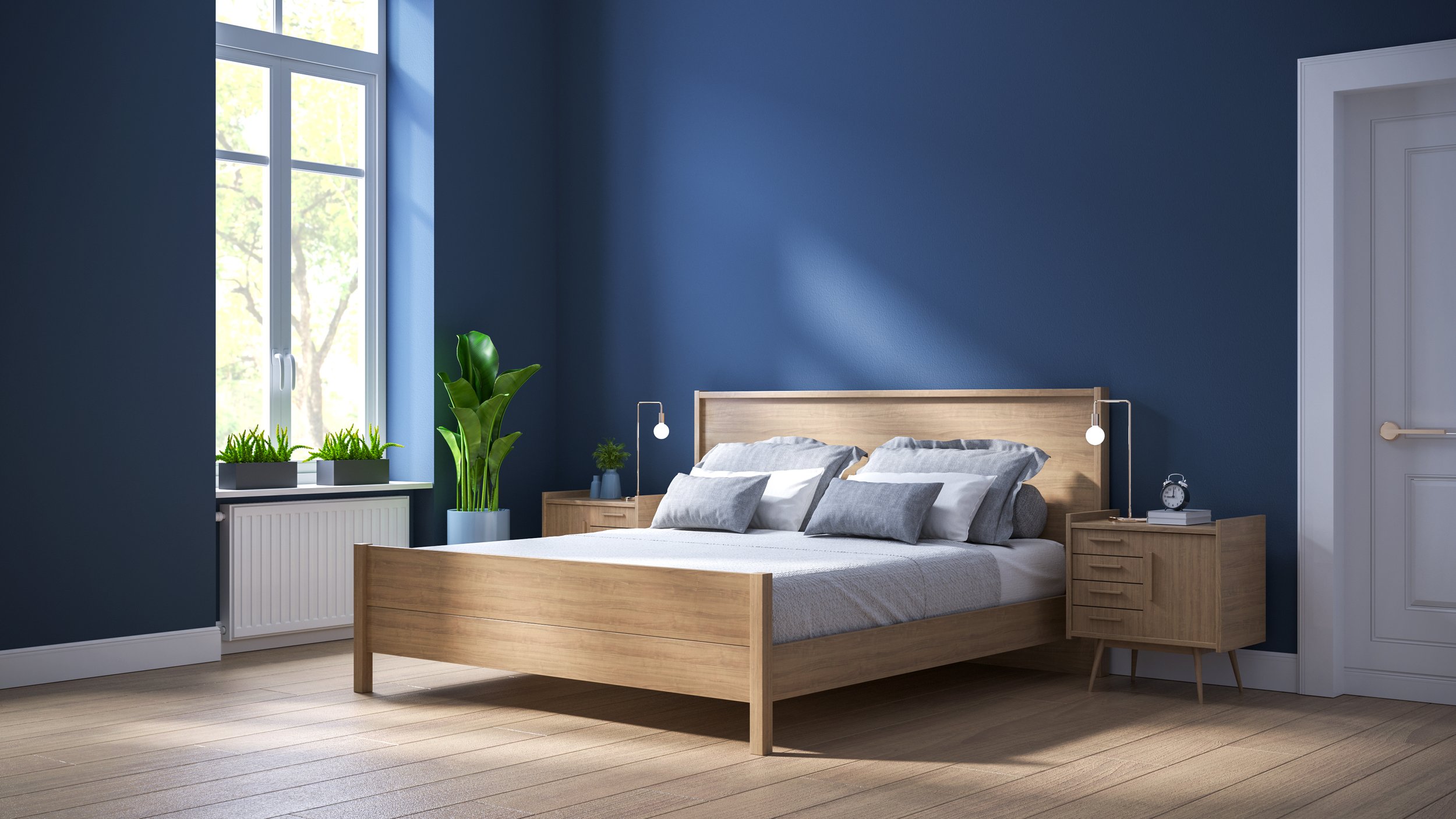
Use darker shades (by adding black to the hue) such as navy to bedrooms to encourage sleep
Display artwork that incorporates blue to tone down and complement warmer colors in a room
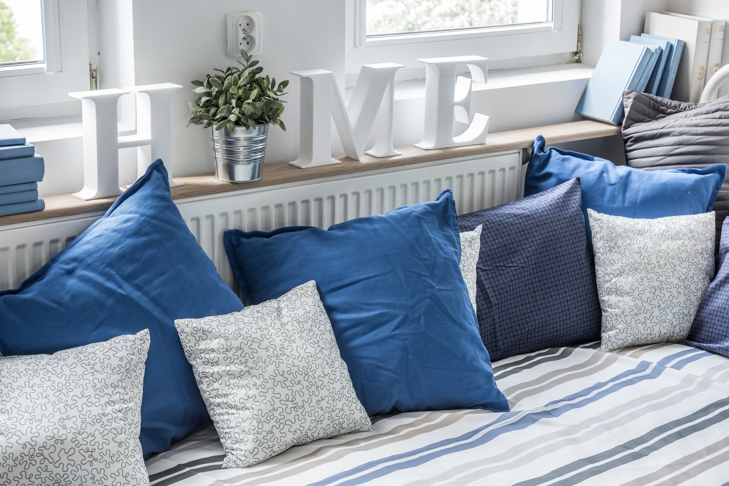
Incorporate pops of blue in furnishings, linens, and pillows to calm busy spaces
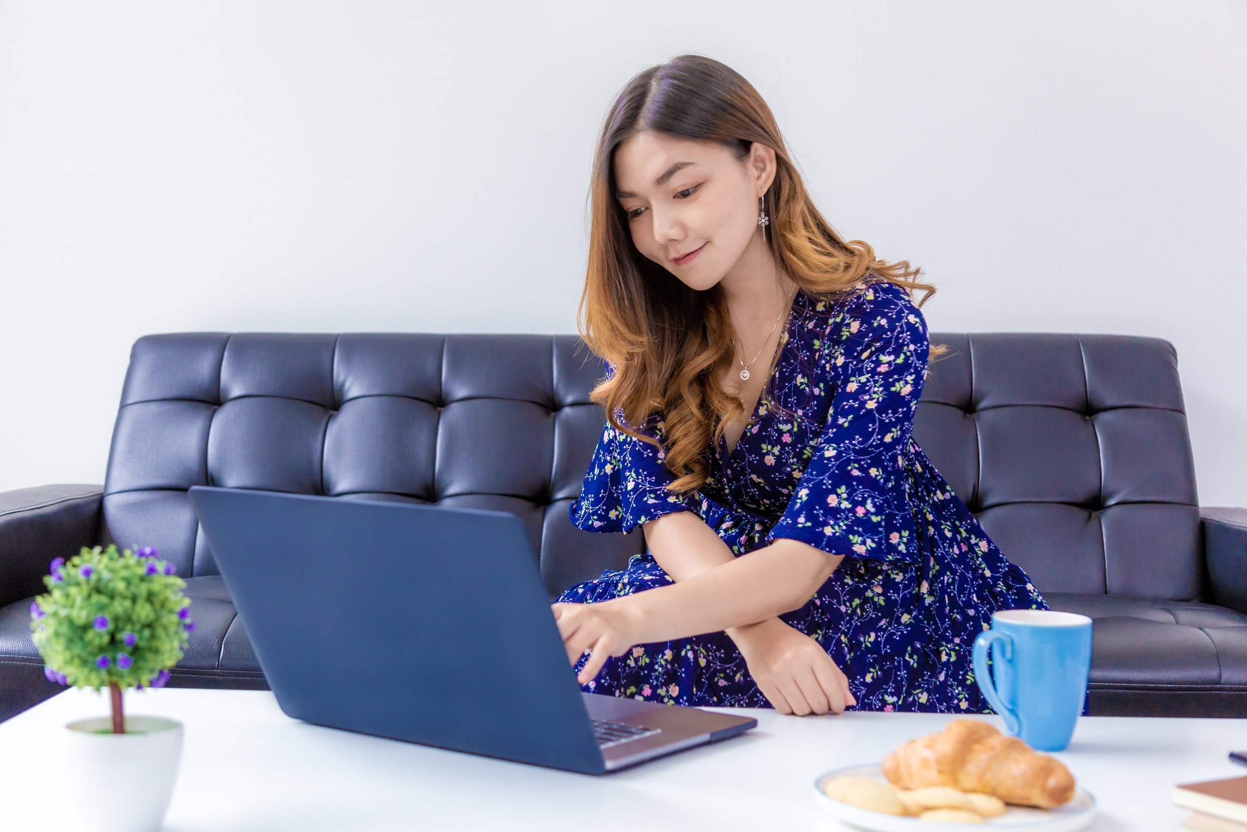
Include blue in areas where mental focus and clarity is desired, such as offices and meeting rooms
Use the color in rooms intended for restoration, retreat and relaxation such reading nooks and bathrooms
Add water features outside windows or in art, where possible
When blue is utilized successfully, the psyche’s evaluation, which is triggered by the perception of the color, will create the relaxed, serene mood intended.
What can blue do for you? Think about how and where you can incorporate this amazing hue into your space to enhance your well-being.
Check back in February for the next color in our Color Study series.